
Icon for Awareness
Fast Fashion Campaign
This project involved multiple phases, starting with researching the social issue and designing an icon based on that topic. The next step was selecting three colors to represent the icon, followed by incorporating a slogan to create a cohesive poster featuring the icon.
For this project, I was tasked with creating and designing an icon for a campaign aimed at raising awareness about a social issue. I chose to focus on fast fashion and conducted extensive research on the topic to inform my designs. The final output included three products: an app icon, a 24 x 36-inch printed poster, and a meme to complement the campaign.

Originally, I considered using a muted green and blue to symbolize the Earth 'dying,' but after receiving feedback, I opted for brighter, more saturated colors. The feedback suggested these would complement the logo better, while the Earth’s 'decline' would be more effectively conveyed through the 'broken' design of the logo itself.
As I continued working on the logo, I felt it was important to incorporate clothing into the design. I came up with the idea of using articles of clothing as shapes to represent the continents in the logo.
Initial Logo Sketches
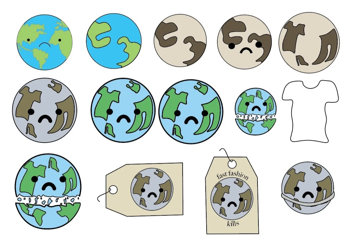

Finalized Logo
After designing the logo, I moved on to incorporating it into a poster with a slogan. I wanted to feature the logo on a tag, playing with the concept of the Earth being the 'price' being paid.
Poster Process

Poster Revisions - Sketches
Unfortunately, after receiving feedback from my peers and professor, I was informed that I had used more than three colors, which was outside the assignment's constraints. As a result, I had to find solutions to maintain color consistency without compromising the design's integrity.


